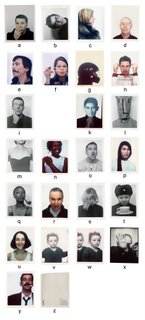
what we like#1: alphabet

click for bigger
Paul Elliman's 'Alphabet' (published by FUSE in 1992) uses the human body in a performative capacity: people making letters in a variety of ways. Creatively taking the notion of typography and laterally sidestepping what we might think of as the most necessary element of typography: the letters themselves.
There's an interesting article on 'the erotics of type' by Max Bruisma which mentions Paul's font here.
2 Comments:
I like these. There is other work going around on people's blogs of typefaces created using the appearance of buildings when viewed from below (sorry I couldn't find a link) but for me these are much more compelling and interesting. I think its due to the subtlety of the creation of the letters, for example the 'B,' which took me a few second to spot, and the fact that they aren't set in stone, they are moments in time where the letters have appeared and I think its that which gives them interest as well as the fact that they are personal as they use people in scenes with a feeling of personality to create the forms.
paul's done another version of this font which is based on mnemonics (a is for apple, b is for ball etc). not so easy to find.
but the idea of the font changing, developing over time is interesting too. he's done a font called 'bits' made up of found objects and that's in a permanent state of development, new characters being added all of the time.
the people were all friends of paul's. i think their brief was fairly open: sit in a photo booth and perform a letter. really interesting range of responses.
Post a Comment
<< Home